A premium brand for LunarCrush
LunarCrush · Proposal in code: the rebuilt site and the first product screens (Recipes, Developers) run on the product's staging branch, and the brand now ships as a package other tools can follow; nothing on production lunarcrush.com
Turning a flat mark into a premium brand proposal: one material, a petrol color nobody in crypto owns, a human layer, a landing built as a media exercise, a live preview with an enterprise funds page, a written brand system with a downloadable kit and a full proposed site, the whole thing rebuilt as real code on the product's staging branch, and now a published Figma design system that several working sessions build pages from in parallel.
The LunarCrush product has a solid token system underneath it, but the brand around the product has no signature. The mark is a single-weight line icon with no depth, seven X accounts drift with placeholder headers, and nothing tells you "this is LunarCrush" at a glance. On November 3 I started a working plan to fix that, and within two days it had become a full proposal: a positioning, a material, a color decision, a human layer, a new landing and a nineteen-slide pitch deck.
The constraint I set on day one still holds: same mark, same geometry, nothing redrawn. This is not a new logo. It is the same brand with presence.
The method came from watching one site closely
The reference that unlocked the approach was pen.dev. They keep two versions of one mark: a flat SVG in the navigation and a static 3D render of the same shape in chrome as the hero. Every feature card uses the same glossy black and chrome objects, so the 3D reads as a system, not a one-off. Everything else stays quiet and the material carries the attention. The takeaway was to copy the method, not the chrome: power comes from the consistency of one owned material.
So I extruded the existing mark in Blender and started rendering materials. The first three directions (graphite with signal green edges, dark glass, cold satin metal) were competent and forgettable. What changed the work was a positioning decision: treat LunarCrush as a premium product. A premium brand needs restraint over effects, real materials and real light, one idea per surface, and zero visible AI. That ruled out neon glow, particle fields and the purple-to-blue sci-fi look that generated brand work defaults to. It also produced a rule I kept for everything after: the mark is one color and one material, never two.
Choosing a color we can own
The color went through a real decision process rather than a mood board. Five single-material renders (obsidian, platinum, graphite, green metal, emerald) led to a first pick, deep emerald. Then I opened the question nobody had asked in years: whether to move off the green at all. Six single-color turns later (jade, petrol, sapphire, bronze, champagne, oxblood), the decision landed on petrol #0E5661, and the argument is the reason I trust it: petrol is our green and our blue made into one color, and nobody in crypto or finance owns it. The palette around it is near-black canvas, bone for text and primary buttons, platinum as the neutral, and the product's green and red reserved strictly for data. The product action color does not change; the brand stops flooding it everywhere.
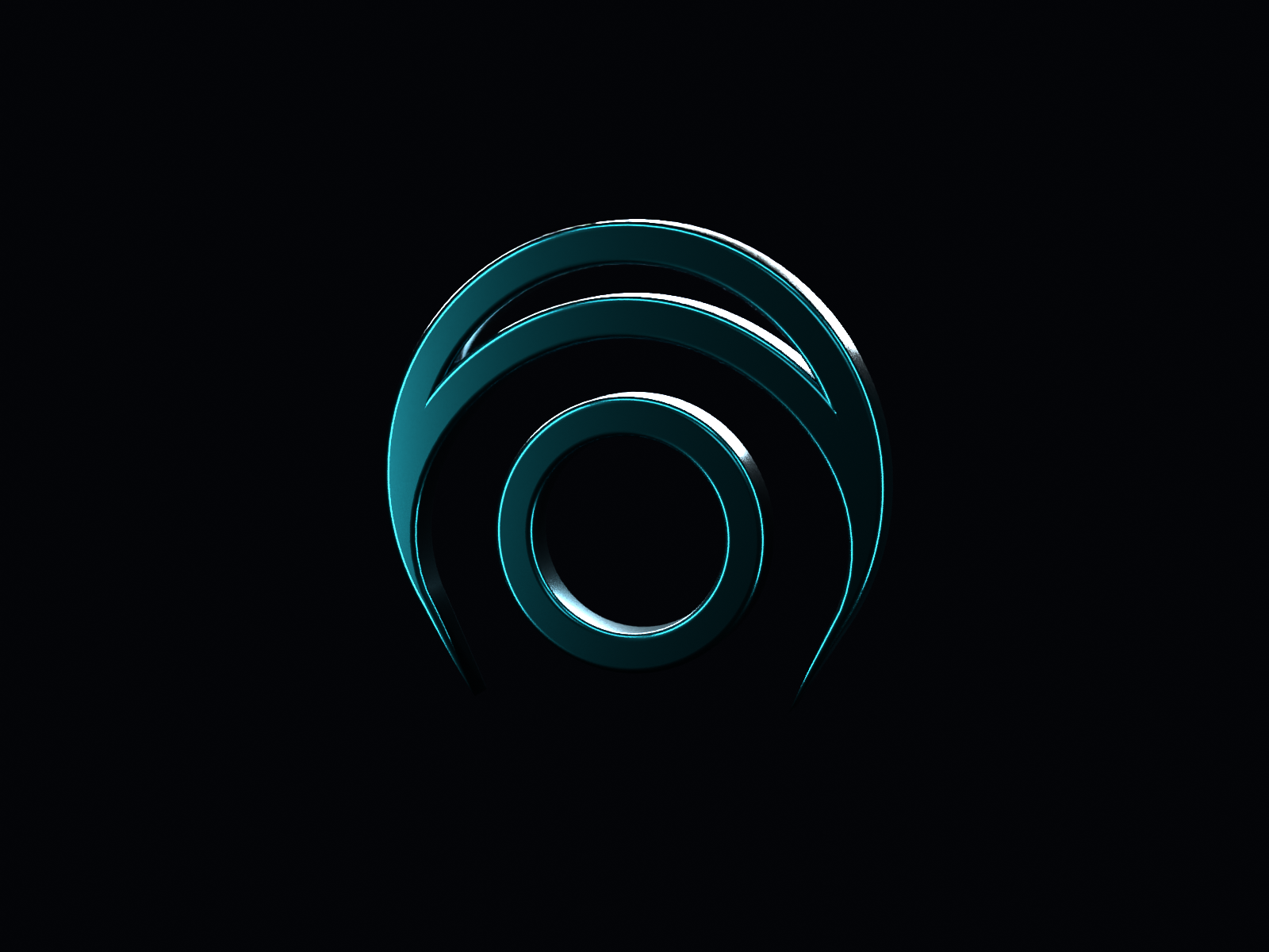
The C2 petrol render that won the color decision. One color, one material, the circle rebuilt as a true ring so the seam is gone.
The team sharpened it before seeing the deck
A team conversation on November 3 gave the proposal its hardest edges. Premium says less. The challenge to design was to make the product feel crafted by the best studio with zero AI visible, with hand-drawn work as the reference. The other push was for texture and life, so premium never reads lifeless. Those inputs became the human layer: paper textures, the mark pressed into paper as foil and blind emboss, a hand-drawn annotation kit I will draw myself on iPad, and one photographic treatment for every face, warm black and white with print grain, no retouching and no generated faces for real people.
From system to proposal
On November 4 the system became something the team can approve or reject: a new landing and a pitch deck, both built in HTML and pushed into Paper and Figma. The promise is live social context, for you and your AI, under the tagline "What the internet is saying, as it says it", with three pledges: Live, Context, Crafted. The landing is deliberately not crypto-first, because the data is not: the live strip leads with the NBA, Alphabet and Spotify, with Bitcoin fourth, and the creator wall leads with real sports and news accounts. Every number, post and creator in the proposal was pulled from LunarCrush on November 4. The pricing page is rebuilt in the new brand as well.
The deck also carries the business argument instead of leaving it implicit: people now arrive through Claude and ChatGPT, so the page leads with what their AI gets, and real people with signed work are the one thing a generated site cannot fake.
Feedback bent the work twice
The first version had a family of seven 3D icons in the petrol material. The feedback was exact and useful: they read as 3D clip art, look at how car, retail and jewelry brands shoot objects, and make the public site a media exercise, not text only. I agreed, killed the icon family, and kept a single object: the mark as a glazed petrol ceramic slab, photographed in one window light with a mullion shadow.
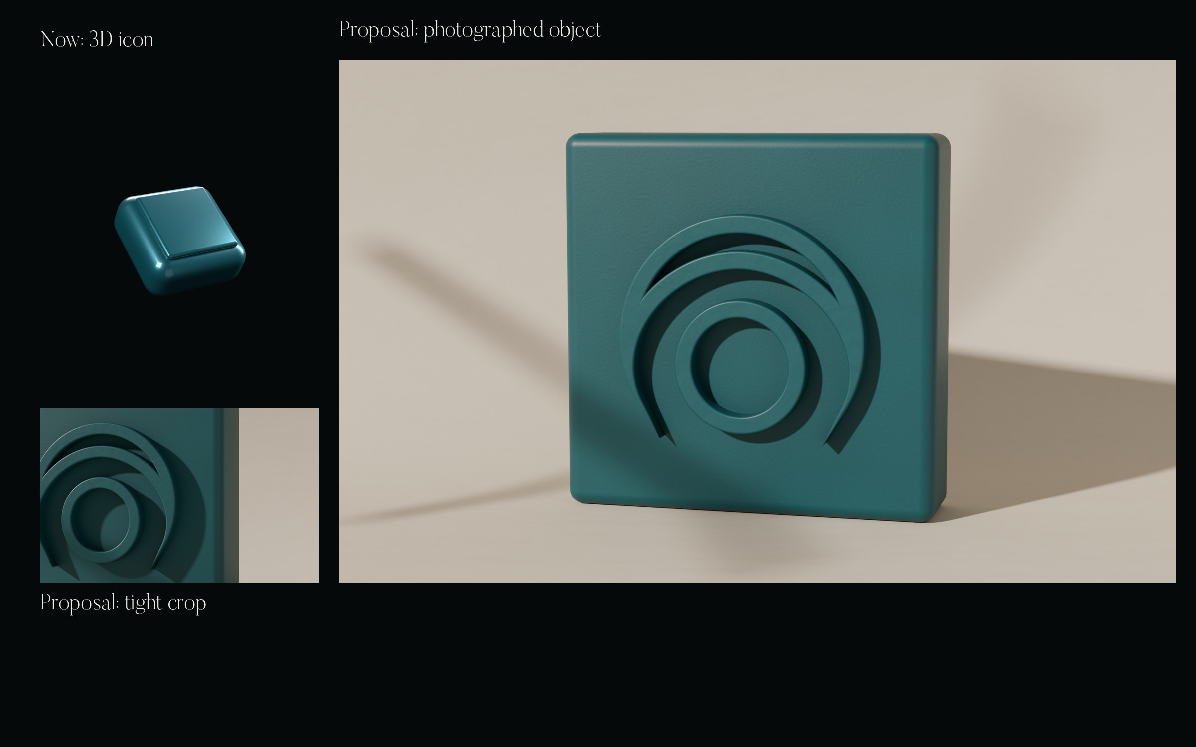
The still life direction that replaced the 3D icons. The brand object becomes something that looks photographed, not generated.
The media exercise then went through its own iteration. Real photography from Wikimedia Commons was graded as one series, and I rejected it the same day, because open-license photos cannot deliver consistent impact. The lifestyle images are now generated with Higgsfield as an art-directed series, labeled honestly as generated in the deck, while team photos and creator avatars stay real. The layout moved onto a measured grid taken from Flatline Agency's site, the craft reference we agreed on. The landing now exists as two comps side by side, a gallery version and a media-hero version.
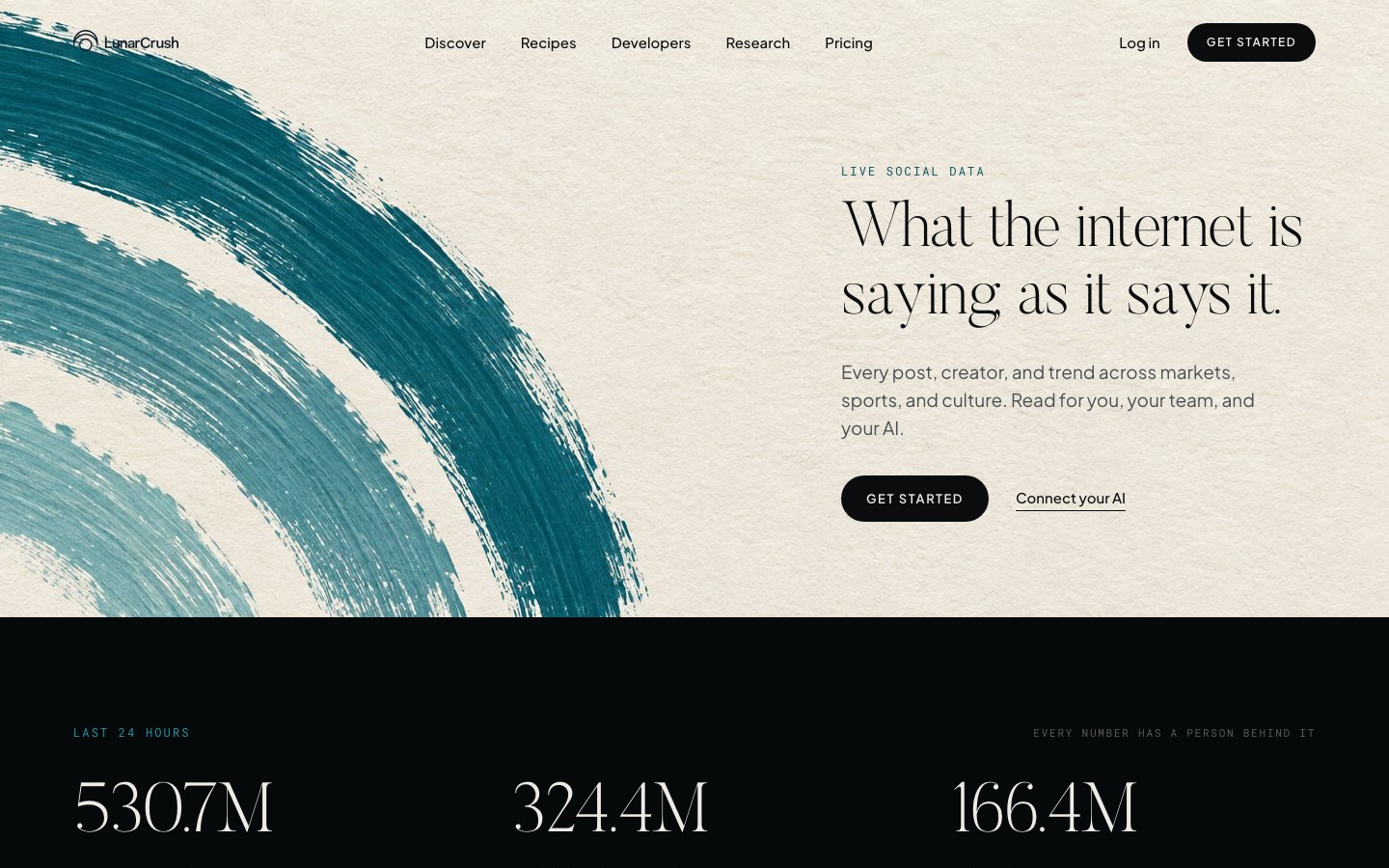
Hero of the media-exercise landing. The photograph is a generated placeholder in the proposal; the numbers and creators under it are real LunarCrush data from November 4.
Teaching the brand to an agent, a week earlier
A related piece of brand governance preceded all this. On October 28 I packaged the current brand's copy and image rules as a Claude skill, with three evaluation tasks (an X post from MCP data, an AltRank top five for Telegram, a LinkedIn post) and ten graders each: no hype words, every number sourced, flat brand background, correct export size. Measured on one run per configuration, the skill moved the pass rate from 70 percent to 100 percent for about 10 seconds and 13K tokens more per task. It encodes today's brand; if the uplift ships, the skill is where the new rules land first, because it is the one place where brand compliance is tested instead of hoped for.
What is real and what is not
Real: every number, post and creator in the proposal, the team photos and the 3D renders. Generated: the lifestyle photography, labeled as such. Placeholder: the brush paint, which I will paint by hand on iPad before anything ships. And the whole thing is a proposal. Nothing here has touched production.
November 5: the landing became a page, and a funds page appeared
The media-hero comp stopped being a comp. The landing now runs as a real page with motion: the hero settles, the numbers count up, a terminal types itself, five-second film loops play with no sound, and a coded Discover panel draws its own chart while real NBA posts arrive every few seconds, nothing locked. The closing mark paints itself on scroll, inner arc to outer, over a paint-free paper base. The whole thing scales the 1440 grid fluidly and falls back to stills under reduced motion. It is published as a noindex preview on a personal Cloudflare Pages project, so the team reviews a working page instead of a picture of one.
The bigger development came sideways. After a team call about an upcoming industry event, the enterprise page moved first, so the brand got its second surface the same day: a funds page in the same system. The hero is a dark office with the city as the subject and a live New York clock. A pinned proof section shows one number per scroll step: 50 to 100 million posts scored every hour, six networks, point-in-time history since 2020, under sixty seconds from post to API. A city carousel runs around the clock with live local times. And the section I like most is the life of a post: scroll draws one real post through posted, peak, and every second wave.
That section forced the most honest work of the day. The brief cited the Binance hack post, so I verified it against LunarCrush data: the post exists, October 29 at 20:32 UTC, 2.14 million engagements over 31 hours, with the peak hour at 856 thousand. The verification also corrected the story. The founder's reply came 43 minutes later, not the figure in the draft, and an on-chain timing claim had to go because our data cannot verify it. Then the section became data-driven: the chart reads a JSON written by a picker script with a rotate mode, so the page can stay current with a fresh post instead of fossilizing one example. The real curve even showed a second wave the simplified version had missed.
Generated imagery turned out to need the same art direction as photography, plus rejection. The hero went through four rounds before I settled on the version with the desk in silhouette and the monitor off. Singapore was re-shot because the model turned eyeglasses into sunglasses, London because an object in a hand morphed mid-clip. The rejected takes stay in the repository as part of the record. And the language got corrected by the team's own precision: the funds hero now reads "What the market is being told", because the data measures reach, not what everyone says.
The page carries its own restraint rules: no price on the page, settlement windows stated plainly, and it does not lead with AI. Both pages remain a proposal with a live preview for the team; nothing has touched production lunarcrush.com.
November 6: the system got written down
Up to this point the brand lived in decisions, renders and two pages. On November 6 it became a system: a working file in Paper with every rule stated, an eleven-section export of those boards, a downloadable brand kit, and enough new pages that the preview now behaves like a full site instead of a landing with an annex.
The written system is deliberately short. The mark rule fits in two sentences: same geometry, untouched, always one color and never two, 3D for heroes and avatars, flat for anything under 64 pixels. A later correction made it stricter: 3D is only for the mark itself, in heroes and avatars, and section icons are never 3D, so the last rendered objects came off the developers and support pages.
Color is where the system earns the word. Petrol #0E5661 is the brand color, and the boards state the accessibility math that most brand decks skip: petrol fails as text on dark at 2.4:1, so it is reserved for the mark and for brand fields, while petrol light #2A93A1 carries accent text and links at 5.5:1, and bone #EDEBE6 does text and primary buttons at 16.8:1. The canvas is near-black #06090A with #0D1416 for cards, and the product's green and red exist only where data lives, never as brand. No gradients anywhere: flat grounds, light on the object only.
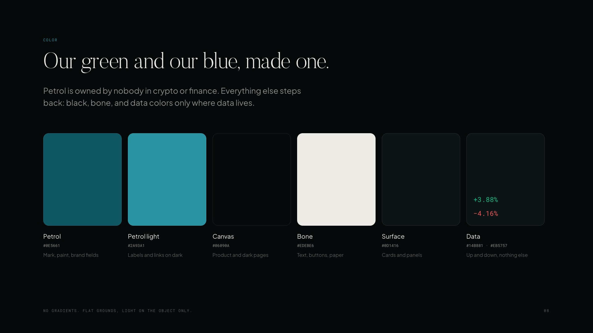
The color section of the working file. Each swatch carries its usage and its contrast ratio, so the palette is a set of rules rather than a mood.
Type is a three-voice system: Butler Light for what the brand says (headlines, statements, quotes from the world, large and in sentence case), Plus Jakarta Sans for product, body and buttons (buttons in caps), and Roboto Mono for numbers, labels and timestamps. The product typefaces do not change; the serif is the only addition, and it belongs to the brand voice alone.
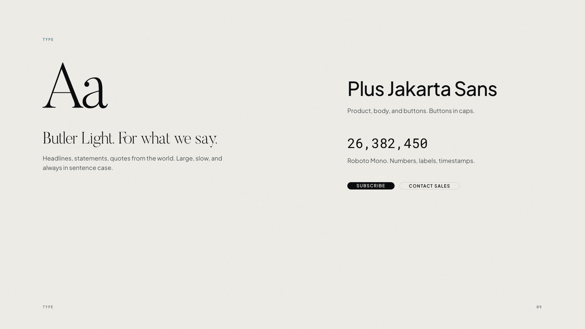
Three typefaces, three jobs. The serif only speaks when the brand does.
The objects section closes the argument that started with the rejected icon family: fewer objects, made like real ones. No 3D icons at all. The mark becomes a thing you could hold, glazed ceramic in window light with a real shadow, used once or twice per page and never as decoration.
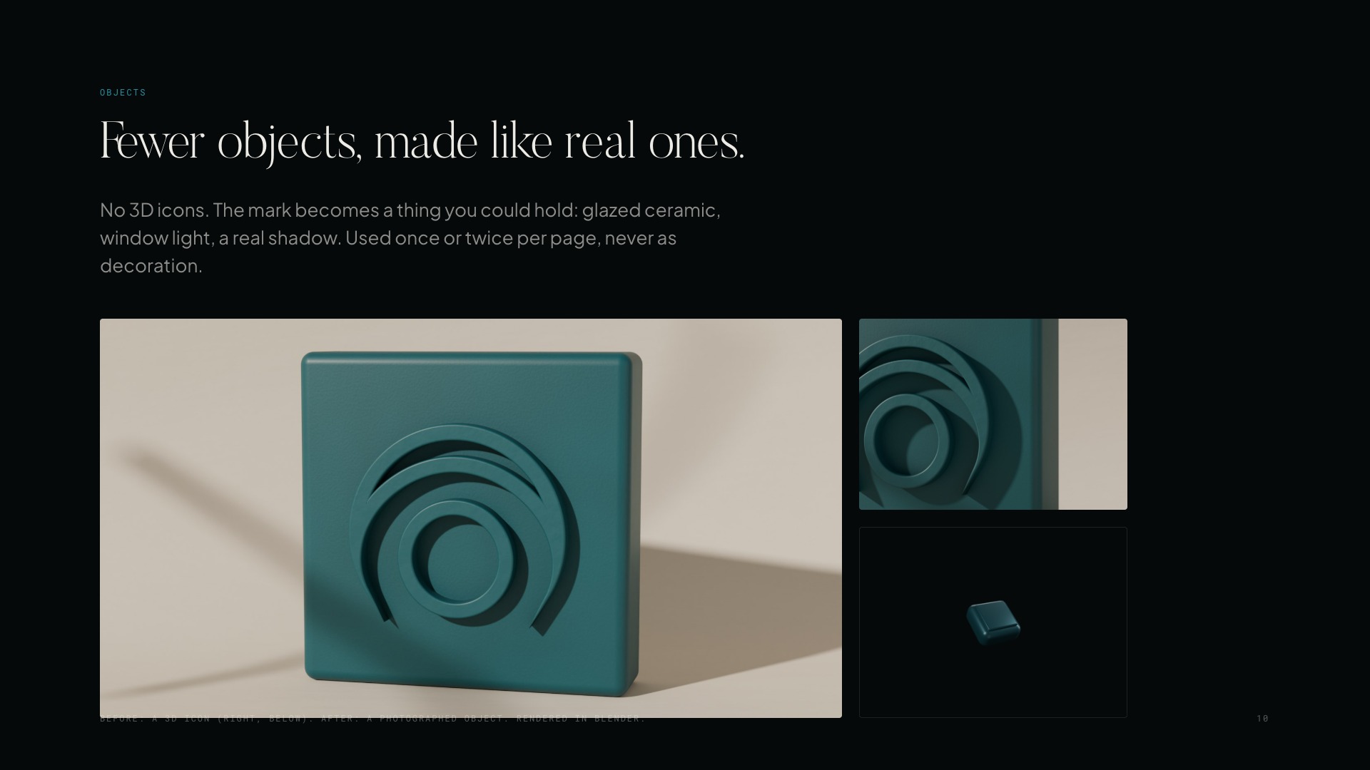
The before and after that defines the object rule. The 3D icon reads as clip art; the ceramic object reads as photographed.
The kit makes the system usable by someone who was not in the room: horizontal and vertical logos and the icon in black and white, the 3D petrol mark, the foil and emboss pressings, and the four textures (bone paper, petrol ink, black grain, halftone wave), downloadable from the proposed brand page.

One of the kit pressings. The texture carries the premium argument at reading distance.
The same day, every item in the proposed navigation got a real page in the new brand: discover, recipes, developers, research with per-study pages, blog, about, support and the brand page itself. Content comes from the current public site and from real LunarCrush data snapshots taken on November 6 and labeled as such, and the coverage numbers were checked against the data before being written down: 41 categories, 5,500+ cryptocurrencies, 4,300+ stocks and ETFs, replacing rounder claims that did not survive the check. Research pages are signed by the founder with his real photo, and the study datasets stay free to download, because the premium rule is about the product, not the research. Two closing images were regenerated and picked from options, and the sample-request form now opens a real email instead of pretending to submit.
One footnote for the record: the kit filenames in the proposal currently misspell the company name, which has to be fixed before anything ships. The whole system remains a proposal on a noindex preview; nothing has touched production lunarcrush.com, and the decisions the team still owns are stated on their own board: the promise and tagline, petrol and Butler as the new color and voice, the time and budget for real photography and hand-made paint, and who signs the research every week.
November 9: the proposal moved into the product's code
The preview did its job and the work changed nature: from pages that argue for a brand to the brand becoming the actual site. The bar also went up. This is not a reskin: the content gets rewritten page by page, the site has to feel more human and crafted, and the density comes down.
The first consequence was an engineering decision. I measured the current landing before touching it: it is a React app that builds HTML and then redraws all of it in the browser, and the home page takes around six seconds to show its main content. Instead of threading the new brand through that, I started a clean v2 inside the product repository: its own fonts, its own CSS, its own images, in a self-contained folder, with the shared token and design system packages untouched. The same home page in v2 measured 2.2 to 2.6 seconds locally. Starting fresh is also what makes the cleanup honest: every piece of the old optimization gets re-earned instead of inherited.
The second consequence was a tooling move. The brand was designed in Paper; the review loop lives in Figma. So the system now exists as four Figma files with clear jobs: a design system library, a brand system library, a marketing file with every landing in desktop and mobile labeled by route, and an app file where the first product screens are being rebuilt from the published components. The marketing file is organized so the site can be commented page by page, image by image, which is exactly how the feedback arrived.
That feedback reshaped the architecture on November 9. The navigation became Platform, AI, Data, Enterprise, Research, Pricing. Enterprise grew from one funds page into a hub with four audience pages: funds, agencies, brands and exchanges, each with its own promise ("Every client, every network, one read" for agencies; "Attention on everything you list" for exchanges). The home hero slides now each link to a real community recipe, and the product story leads with "Ask it. Automate it. Build on it.", with Discover following as "Or just look". Three pages I had not planned got written the same day in the same system: Platform ("One source. Every way in."), AI ("Your AI knows the past. Give it today.") and Data ("What we collect, and how.").
And then the line that matters: the whole structure was committed and deployed to the product's staging branch. For the first time the proposal is not a parallel preview, it is the site's own code, with the logged-in redirect, analytics and canonical URLs preserved on every route. Verification was against the local build, because staging sits behind a login. What is explicitly not done: the pricing page still runs the current checkout, the recipes route is still the app, and the SEO titles for the new pages are drafted from their hero text and need a proper pass. The Figma marketing file closed the day at eighteen pages in menu order, desktop and mobile, recaptured from the real build.
Nothing has touched production lunarcrush.com. But the distance between the proposal and production is now one review, not one rebuild.
November 10: one library, many hands
Once the brand lived in Figma, the work stopped being one session and became a small team of them. I split the day across parallel working sessions with clear jobs: one owned the design system library, one built the marketing pages, one rebuilt the web app screens, and I carried requests between them the way a design lead carries requests between teams. The sessions literally filed feedback to each other in rounds, and I arbitrated: the marketing session reported which components it was missing, the design system session built them and answered with a handoff note, and when something blocked publishing (two component sets shared a property name, which Figma silently refuses to publish), the bug report crossed the same channel and got fixed the same day. The library itself only I can publish, so every round ended at my desk.
The library that came out of those rounds is the most complete system I have had on this product. One Figma file now holds the variables (color in Dark and Paper modes, sizes, a layout collection that resizes marketing type between 1440 and 390), 36 text styles, and components in layers: a core everyone shares, web app patterns, native mobile bars, and a marketing layer with hero, nav, pricing tiles, plans table, logo wall and FAQ rows. The reading rules travelled from prose into the file: one hero figure per view, five table columns by default, every number with a plain label above it, each metric keeping its own fixed color, and red leaving data only for input errors.
Two decisions from the day matter beyond the inventory. First, real data everywhere: the example charts stopped being illustrative squiggles and now draw Bitcoin engagements per hour and API requests per day pulled on November 10, the sparklines carry eleven real topics because most topics have no price, and the recipe previews compare Coca-Cola against Pepsi and the NFL against the NBA, because I asked for the system to stop looking crypto-only. Second, the detail page got redesigned at the component level: price becomes the single ink line against its opening level with the selected metric as bars behind it, sentiment loses its ringed gauge for one split bar, the network donut becomes ink steps, and the word cloud becomes a ranked list. Every replaced drawing had a reason written next to it.
The registry got a name system too: every Figma page now carries a code (BS, DS, WA, MK, MA, EM plus a number), starts with a shared page header component carrying its status and link, and a new Email v2 file took the 32 account-state emails out of Paper into the same library, one page per flow. A written handoff document travels with the library so the page sessions know what exists, what changed under their feet, and what is still missing: the date picker, the research study layout, and the whole v2 theme in the product app code, where the tokens still exist only in the marketing CSS.
Everything in Figma remains the proposal's working surface; the staging build from November 9 is unchanged by this, and nothing has touched production.
November 11: the screens caught up and the brand became a package
Three fronts moved in parallel the day after the library landed, and all three used it.
The first was the product itself. Recipes went v2 on the product's staging branch piece by piece: the stepper that builds a recipe (the question in large Butler, two lines at most, with its help text underneath), the results screen with its buttons, chips and icon discs on the system's radii, and then My recipes and Community with their page titles in the same voice. One product decision came out of reviewing it: My recipes should never open empty. Instead of a blank state asking you to create something, the page now proposes suggestions, so the first visit starts with something to react to. Developers moved too: its overview now shows live per-minute usage read from what the API already returns on every call, which meant that panel could ship without waiting on anyone. And a bigger layout idea got its first pass: one shared frame for the logged-in pages, with the content in the main column and plan, usage and key on the right, applied across Developers, the API reference and the AI, MCP, CLI and keys pages.
The second front was Figma. The marketing pages stopped being flat captures: seven of them (Platform, AI, Data, Enterprise, Agencies, Brands, Exchanges) are now rebuilt from the published components in desktop and mobile, with 144 real titles set in Butler, plus a social accounts page covering the brand's seven profiles. A script walked every remaining page attaching loose text layers to the library styles, so a type decision now propagates instead of dying in a capture. The publish blocker from the day before is resolved and the library publishes clean.
The third front is the one that changes the brand's reach. The team asked for design context to feed the tools that generate social visuals, and the answer became a package: a context file that teaches the visual language to any model or tool (the color table with its rules, the three typefaces and their jobs, the one-message-one-focal-element layout, the clay object and photography rules, a list of do-nots, and a ready prompt block for image generators), shipped next to the real assets: the logos, the nineteen clay objects, the textures and finished example pieces. The file's core rule is the system's own: the mark and the numbers are never generated, always real. The brand stopped being a proposal someone presents in a meeting and became something another machine can follow without asking.
Everything here remains staging and working files; nothing has touched production lunarcrush.com.
This entry is part of the LunarCrush product story.